
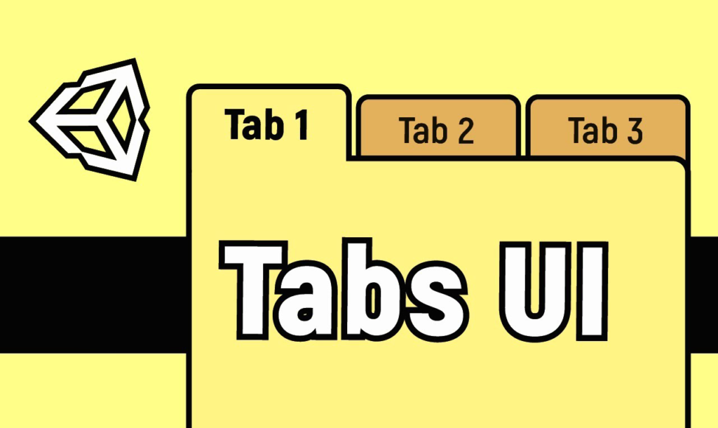
Master Modular Menus:
Creating responsive navigation menus or settings screens with toggleable sections can quickly lead to a messy hierarchy full of spaghetti code. If you manually toggle multiple canvas panels via messy GameObject.SetActive script calls scattered across various UI buttons, extending your menus later becomes a headache.
To help you build structured interface systems instantly, we are sharing a production-ready, highly modular solution in our latest release: the EasyUI Tabs System! This customizable system completely automates the linking between your menu navigation buttons and their corresponding content panels, giving you a smooth, professional layout system that supports both Horizontal and Vertical layouts.
🛠️ How It Works: The Core Logic
Instead of forcing you to write tedious click-listeners or drag-and-drop actions for every single menu button, this system uses an automated hierarchy wrapper to handle your layout logic procedurally:
- Automatic Index Mapping: On
Start(), the main controller automatically scans your UI layout hierarchy. It pairs each child inside the button container with the corresponding child inside the content container based on their order. - Smart Event Toggling: When a button is clicked,
OnTabButtonClicked(int tabIndex)triggers. It deactivates the previously viewed screen, enables the new content panel, swaps the active/inactive image colors dynamically, and disables interaction on the active button so users can’t accidentally spam a section they are already viewing. - Built-in UnityEvents: The controller features an interactive
OnTabChangeUnityEvent dispatcher. This lets you bind custom audio triggers (like our UI click sound packs!), achievement checks, or data initialization logic directly from the Inspector window without modifying the source code. - Real-time Editor Syncing: Utilizing custom
#if UNITY_EDITORexecution tags, changing your theme colors or tab spacing parameters in the Unity inspector window immediately refreshes your UI layout visual properties inside the scene view editor without needing to hit Play!
🚀 Skip the Setup: Drag-and-Drop Ready Prefabs!
If you want to skip the manual setup completely and save valuable design time, the package comes with two pre-made, production-ready prefabs that are completely configured out of the box:
- Horizontal Tabs Prefab: Perfect for standard top-navigation navbar panels across the upper portion of your screens.

- Vertical Tabs Prefab: Optimized for clean, modern sidebar settings menus down the left or right edge.
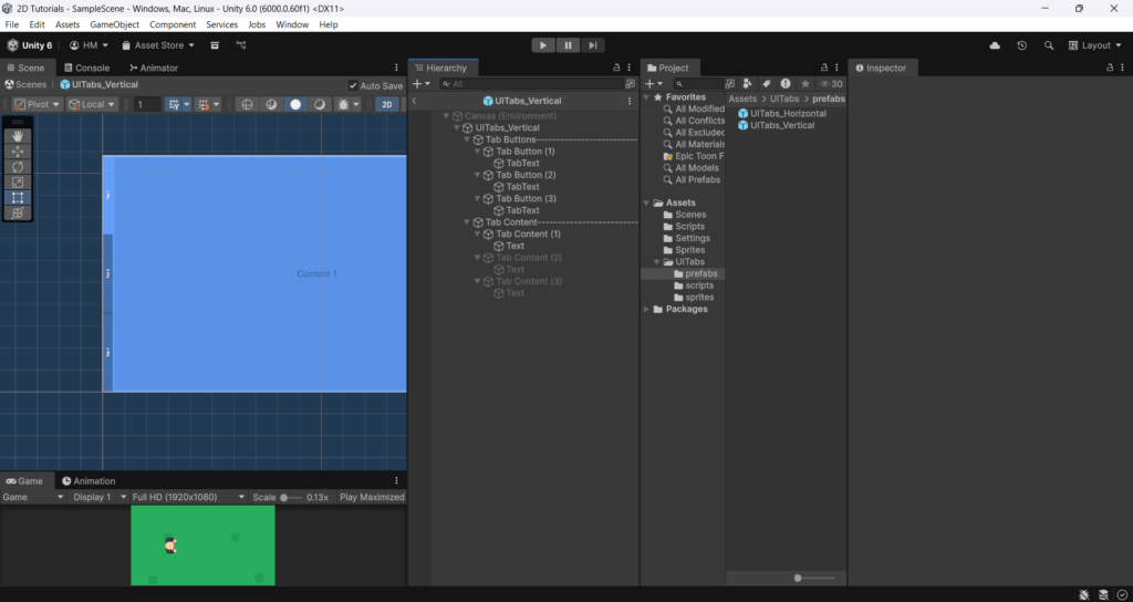
Both variants come completely assembled with the necessary nested structures, responsive image masks, layout scripts, and internal field references pre-linked. All you have to do is drop a prefab into your active UI Canvas workspace, adjust the background colors to match your game style, and start adding your custom text or level select elements inside the content containers!
🛠️ Step-by-Step Manual Setup (If Building from Scratch)
If you prefer to configure your own custom UI layouts using our source scripts, follow these exact layout steps:
Step 1: Create the Hierarchy Structure
For the automated indexing system to run successfully, your Unity GameObjects must follow a very straightforward, clean nesting structure:
- Right-click in your Hierarchy panel and select UI > Panel or Create Empty to act as your main component root (e.g.,
Settings_Menu_UI). - Inside that root object, create exactly two direct child objects:
- First Child (Index 0) – The Buttons Container: Name this
Buttons_Holder. Add a layout group component (like Horizontal Layout Group or Vertical Layout Group) along with a Content Size Fitter if needed. - Second Child (Index 1) – The Content Container: Name this
Content_Holder. This object must hold an Image background component to represent the main background display panel. Inside this container, add your various gameplay panels (e.g., Audio Panel, Graphics Panel, Gameplay Panel).
- First Child (Index 0) – The Buttons Container: Name this
⚠️ Important Check: Ensure the number of button elements inside your first container matches the exact number of content panels inside your second container!
Step 2: Set Up the Buttons
- Inside your
Buttons_Holder, create your navigation UI Buttons. - Attach the
TabButtonUI.csscript directly to each individual button GameObject. - Select a button, look at its Inspector, and drag its own native Button, Image, and Layout Element components into their respective slots on the
TabButtonUIcomponent script.
Step 3: Attach the Main Controller
- Select your main component root object (
Settings_Menu_UI). - Depending on your menu orientation choice, attach one of the layout wrappers:
- Attach
TabsUIHorizontal.csfor a top-bar layout. - Attach
TabsUIVertical.csfor a side-bar layout.
- Attach
- In the Inspector window, tweak the Theme Color and Tab Spacing fields under the Tabs Customization header variables. The editor will automatically configure the background image color and update layout group distances instantly!
📋 Source Code: The Complete Scripts
Create these four scripts inside your Unity project folder (Assets/Scripts/UI) and name them exactly as written below to let you copy-paste the architecture immediately:
1. TabButtonUI.cs
C#
using UnityEngine;
using UnityEngine.UI;

public class TabButtonUI : MonoBehaviour
{
   public Button uiButton;
   public Image uiImage;
   public LayoutElement uiLayoutElement;
}
2. TabsUI.cs
C#
using UnityEngine;
using UnityEngine.UI;
using UnityEngine.Events;

//------- Created by  : Hamza Herbou
//------- Email       : hamza95herbou@gmail.com

namespace EasyUI.Tabs {
   public enum TabsType{
      Horizontal,
      Vertical
   }
   public abstract class TabsUI : MonoBehaviour {

      [System.Serializable] public class TabsUIEvent : UnityEvent <int> {

      }

      [Header ("Tabs customization :")]
      [SerializeField] private Color themeColor = Color.gray;
      [SerializeField] private float tabSpacing = 2f;
      [Space]
      [Header ("OnTabChange event :")]
      public TabsUIEvent OnTabChange;

      private TabButtonUI[] tabBtns;
      private GameObject[] tabContent;

      #if UNITY_EDITOR
      private LayoutGroup layoutGroup;
      #endif

      private Color tabColorActive, tabColorInactive;
      private int current, previous;

      private Transform parentBtns, parentContent;

      private int tabBtnsNum, tabContentNum;


      private void Start () {
         GetTabBtns ();
      }

      private void GetTabBtns () {
         parentBtns = transform.GetChild (0);
         parentContent = transform.GetChild (1);
         tabBtnsNum = parentBtns.childCount;
         tabContentNum = parentContent.childCount;

         if (tabBtnsNum != tabContentNum) {
            Debug.LogError ("!!Number of <b>[Buttons]</b> is not the same as <b>[Contents]</b> ("
            + tabBtnsNum + " buttons & " + tabContentNum
            + " Contents)");
            return;
         }

         tabBtns = new TabButtonUI[tabBtnsNum];
         tabContent = new GameObject[tabBtnsNum];
         for (int i = 0; i < tabBtnsNum; i++) {
            tabBtns [ i ] = parentBtns.GetChild (i).GetComponent <TabButtonUI> ();
            int i_copy = i;
            tabBtns [ i ].uiButton.onClick.RemoveAllListeners ();
            tabBtns [ i ].uiButton.onClick.AddListener (() => OnTabButtonClicked (i_copy));

            tabContent [ i ] = parentContent.GetChild (i).gameObject;
            tabContent [ i ].SetActive (false);
         }

         previous = current = 0;

         tabColorActive = tabBtns [ 0 ].uiImage.color;
         tabColorInactive = tabBtns [ 1 ].uiImage.color;

         tabBtns [ 0 ].uiButton.interactable = false;
         tabContent [ 0 ].SetActive (true);
      }

      public void OnTabButtonClicked (int tabIndex) {
         if (current != tabIndex) {
            if (OnTabChange != null)
               OnTabChange.Invoke (tabIndex);

            previous = current;
            current = tabIndex;

            tabContent [ previous ].SetActive (false);
            tabContent [ current ].SetActive (true);

            tabBtns [ previous ].uiImage.color = tabColorInactive;
            tabBtns [ current ].uiImage.color = tabColorActive;

            tabBtns [ previous ].uiButton.interactable = true;
            tabBtns [ current ].uiButton.interactable = false;
         }
      }


      #if UNITY_EDITOR
      public void UpdateThemeColor (Color color) {
         tabBtns [ 0 ].uiImage.color = color;
         Color colorDark = DarkenColor (color, 0.3f);
         for (int i = 1; i < tabBtnsNum; i++)
            tabBtns [ i ].uiImage.color = colorDark;

         parentContent.GetComponent <Image> ().color = color;
      }

      private Color DarkenColor (Color color, float amount) {
         float h, s, v;
         Color.RGBToHSV (color, out h, out s, out v);
         v = Mathf.Max (0f, v - amount);
         return Color.HSVToRGB (h, s, v);
      }

      public void Validate (TabsType type) {
         parentBtns = transform.GetChild (0);
         parentContent = transform.GetChild (1);
         tabBtnsNum = parentBtns.childCount;
         tabContentNum = parentContent.childCount;

         tabBtns = new TabButtonUI[tabBtnsNum];
         tabContent = new GameObject[tabBtnsNum];

         for (int i = 0; i < tabBtnsNum; i++) {
            tabBtns [ i ] = parentBtns.GetChild (i).GetComponent <TabButtonUI> ();
            tabContent [ i ] = parentContent.GetChild (i).gameObject;
         }

         UpdateThemeColor (themeColor);

         if (layoutGroup == null)
            layoutGroup = parentBtns.GetComponent <LayoutGroup> ();

         if (type == TabsType.Horizontal)
            ((HorizontalLayoutGroup)layoutGroup).spacing = tabSpacing;
         else if (type == TabsType.Vertical)
            ((VerticalLayoutGroup)layoutGroup).spacing = tabSpacing;

      }
      #endif

   }
}
3. TabsUIHorizontal.cs
C#
using UnityEngine;
using UnityEngine.UI;
using EasyUI.Tabs;

public class TabsUIHorizontal : TabsUI
{
    #if UNITY_EDITOR
    private void Reset() {
        OnValidate();
    }
    private void OnValidate() {
        base.Validate(TabsType.Horizontal);
    }
    #endif
}
4. TabsUIVertical.cs
C#
using UnityEngine;
using UnityEngine.UI;
using EasyUI.Tabs;

public class TabsUIVertical : TabsUI
{
    #if UNITY_EDITOR
    private void OnValidate() {
        base.Validate(TabsType.Vertical);
    }
    #endif
}
⚠️ Common Pitfalls to Avoid
- The Broken Array Error (Mismatched Elements): If you see a red
!!Number of [Buttons] is not the same as [Contents]error code flash across your console log, double-check your asset layout. The system requires a perfect 1:1 match between button triggers and UI screens to prevent script crashes. - Missing Component References: Each button inside your navbar container requires the
TabButtonUI.csscript attached directly to its inspector. Ensure you drop the button’s native Button component, Image component, and Layout Element into their respective script reference fields so the automated tracking loop can manipulate them properly.
Wrap Up
Organizing your production layouts with a strict container approach keeps your workspace clean, speeds up UI composition, and ensures you can add extra settings panels or interface segments effortlessly down the road.
Whether you want to construct your system step-by-step or drop in our ready-made horizontal and vertical prefabs to save time, this package handles the heavy lifting for you. Click the link below to head over to our storefront, download the full template package completely for free, and give your game a highly polished, structural menu network today!